Is the color scheme you’ve chosen for your website triggering a desired response?
Everyone has favorite colors they tend to gravitate towards when it comes to their work or otherwise, but the skilled designer understands the importance of evaluating a color scheme based on the meanings of the color in relation to the product/service being promoted.
Good color choices take careful planning and when done correctly can influence how a visitor interprets what they see as much as layout and typography.
In this article we’ll take a look at beautiful color schemes and how they are successful in getting a visitor engaged with your content.
1. Mea Cuppa
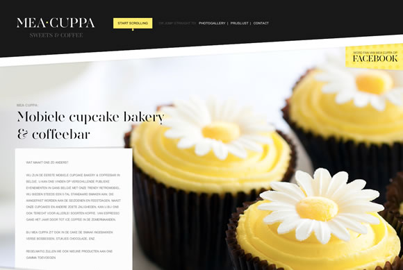

- #191919
- #DFE2DB
- #FFF056
- #FFFFFF
A neutral color scheme with a pop of color (yellow) has a very classy and elegant feel – appropriate for an upscale mobile cupcake bakery. A minimal color scheme can still create contrast and give a unique, impactful visual impression.
2. The Big Top


- #C63D0F
- #3B3738
- #FDF3E7
- #7E8F7C
Analogous color schemes are some of the easiest to create and can be adjusted by manipulating their tone, shade, and tint. In doing so you created contrast which draws the eye into the design more easily. The design is elevated further by a custom color scheme on the slide navigation which adds a striking twist to an otherwise subdued palette.
3. Tori’s Eye


- #005A31
- #A8CD1B
- #CBE32D
- #F3FAB6
In Tori’s eye we see the effects of a simple yet powerful color palette centered around shades of primary colors like green and blue. This monochromatic color scheme is easy to pull of as one shade of a color will almost always work with another shade of the same color. As a rule of thumb – use more shades of fewer hues.
4. Event Finds


- #558C89
- #74AFAD
- #D9853B
- #ECECEA
You can see the effect of using tints of one hue on the website for Event Finds. Contrast is achieved through the use of a complimentary color, which in this case are orange call to actions.
5. Cheese Survival Kit


- #2B2B2B
- #DE1B1B
- #F6F6F6
- #E9E581
For many websites, the logo is designed first and the color scheme is dictated from there. This is evident on the Cheese Survival Kit website, which uses contrasting colors for an impactful visual impression. The yellow accent color serves as a call to action and is used sparingly as bright colors typically should. A splash of color here or there will draw the visitor in, but when used everywhere it loses its impact.
6. Nordic Ruby
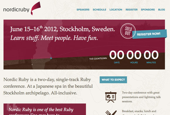

- #7D1935
- #4A96AD
- #F5F3EE
- #FFFFFF
A neutral background works well against highly-saturated colors on the website for Nordic Ruby. Plum is used as a prominent color for the header, while a light blue serves as contrast in the form of call to actions and headings.
7. Lake Nona


- #E44424
- #67BCDB
- #A2AB58
- #FFFFFF
For a community that practices healthy, sustainable living a fresh, modern color palette is a suitable choice. This split complimentary color scheme adds just the right amount of interest to an otherwise white page.
8. Lemon Stand App


- #404040
- #6DBDD6
- #B71427
- #FFE658
This website features a triadic color scheme with blue being the primary color that is the foundation of the page and pops of yellow used in calls to action for contrast. Again, bright colors used sparingly have much more potential to elicit an action than those used frequently.
9. Mint.com
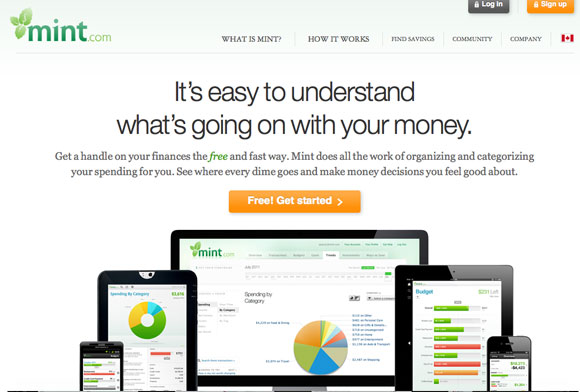

- #585858
- #118C4E
- #C1E1A6
- #FF9009
Mint.com is a website that put a lot of attention into their visual design in garnering the trust of its audience. The color palette is clean and fresh and the use of subtle gradients and shadows give the website that extra polish. The green is soothing while the use of the complimentary orange makes calls to action stand out and inspire the desired action.
10. Odopod


- #191919
- #DF3D82
- #FFFFFF
Pink is an underused background color but that doesn’t mean it can’t be used tastefully, such as on the Odopod website. When used non-conventionally, such as on a tech/design platform, the color has the ability to make your work stand out much more. Additionally, lesser used colors surprise the visitor and draw the eye.
Choosing the right color palette for your web design project takes time and skill as well as the knowledge of the particular product or service your marketing.
The best way to learn is to practice creating color schemes – whether in Photoshop or through free services such as Adobe Kuler. Create an inventory of palettes that strike your interest to draw from when the times arises.
What color schemes reasonate with you?

0 comments:
Post a Comment
Don't be shy, please leave your comments HERE.